The Jurassic Park logo, also dubbed the Logosaurus by fans, is a collective term used to describe the various logos used to market the novels and films. The logo was designed by Chip Kidd and Universal Pictures Marketing Executive Tom Martin after the skeleton that appeared on every cover of the book and first appeared in Jurassic Park, where they were seen all over the park's merchandise.
The logo soon became so distinctive and well-known that the sequels (which focused on a different island, Isla Sorna, which was not the site of the theme park and therefore had no logos) had new logos designed that were used on posters and official film-related merchandise. There have also been video games that unique logos have been specifically designed for.
Due to the success of the franchise, the logo has become iconic and is often spoofed, with notable examples being the cover of Weird Al Yankovic's Alapalooza, which featured Weird Al as a dinosaur skeleton. This was done as the most famous track on the album was spoofing the Jurassic Park films.
Novels
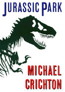
The original novel had no actual logo, only the front end of a Tyrannosaurus skeleton. The book cover, designed by Chip Kidd, was based on the silhouette of the AMNH 5027 Tyrannosaurus skeleton, which is mentioned within the novel. This design was adapted for the movie, and showed the dinosaur enclosed in a yellow circle, and towering above a jungle silhouette and a black bar with the words "Jurassic Park." After the film's release, movie tie-in paperbacks were released, featuring the movie's logo.
Films
Jurassic Park
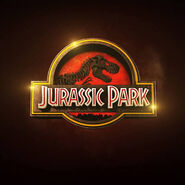
The only film to actually feature its logo, Jurassic Park's logo was designed by Chip Kidd as the official park logo that also served as the film's logo. It was based on the Tyrannosaurus rex skeleton that was used on the cover of the book. It was seen on the park's Jeeps, the dinner plates, the fences, the maps and brochures, the projection screens, lunchboxes and other merchandise among numerous other places.
Jurassic Park was the only film in the series where the logo itself is used in the film. Seen are the official logo, the same logo with a yellow background instead of red that was embroidered among worker uniforms, a pure black and white version of the logo decorating the ceramic plates used to s another one seen in the projection room that was the same logo, only with a fossilized look to it, as if it was carved in stone.
Prior to the release of Jurassic World: Fallen Kingdom, the logo underwent a redesign for Blu-ray and digital releases. This change included a more Jurassic World themed aesthetic, with Jurassic Park's branded background color being red.
The Lost World: Jurassic Park
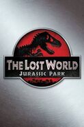
The novel retained the skeleton from its predecessor, except it was tilted vertically and you only saw the jaw and teeth. The movie's logo underwent some changes. Overall, it looked as if it was carved out of stone or wood and was cracked all over to give it an aged, overgrown and primitive look.
The main text in the bar was "The Lost World", with the words "Jurassic Park" as a subtitle. Due to the extra room needed for the subtitle, the logo could no longer remain a perfect circle, though few people noticed it, as the change was slight. This logo would also appear on material for the Trespasser video game.
The Lost World would get a logo alteration for Blu-ray and digital releases alongside the other films in the series. This included a Jurassic World themed logo, and a silver metal background.
Jurassic Park III
The logo for Jurassic Park III underwent the biggest change of all. The black and yellow colors of the circle, bar, and jungle were all replaced with metal. Silver Pteranodons, who were a major part of the film, were also added flying above the jungle. Claw marks were added on the bar to represent "III".
Most noticeably, however, this logo replaced the black T. rex skeleton with a silver Spinosaurus skeleton. The first skeleton used for the Jurassic Park III logo was Baryonyx, however, it was replaced by the very similar Spinosaurus skeleton. Baryonyx, while having the spotlight taken from it, was later mentioned in the film, when Billy confused it with the Spinosaurus.
In the years following Jurassic Park III's release, the film's logo would undergo multiple changes for subsequent DVD and Blu-ray releases. These changes would include the replacement of the divisive Spinosaurus with the famous Tyrannosaurus rex, changes involving the style of III, and color changes. The most recent incarnation of the logo, used on updated Blu-ray and digital releases has a Jurassic World themed aesthetic, allowing for brand consistency, while also possessing a unique orange hue.
Jurassic World
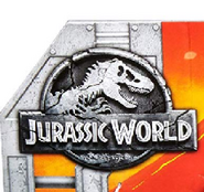
The official logo for Jurassic World continues the silvered outlining that has been used in the franchise logo since the third film. However, the Tyrannosaurus skeleton had returned as the face of the franchise, and so appears on the logo for the fourth film. The largest change, however, is the background colors. The new logo completely omits the color scheme of the previous films, and instead utilizes a blue background.
The title is written in silvery-white letters, and is filled in with blue rather than red as in previous incarnations of the logo. Another change worth noting is the use of a different font compared to previous logos; the thicker font type used on the "Jurassic Park Ultimate Trilogy" boxset is used instead. Within the film, the logo is colorful with the tint of blue within the background and gray within the writing and shield frame, the logo is a viral marketing for the park within the film and marketing toys.
A second Jurassic World logo was produced for the theatrical movie poster and corrects the aforementioned inconsistencies found in props and some official merchandise. This version excludes the use of a color scheme and instead has a look that appears to have been carved out of stone or metal. In addition, the image is dimly lit with only a small portion of light being visible at the head of the Tyrannosaurus skeleton.
Falling in line with prior Blu-ray and digital releases, Jurassic World had a slightly redone logo for brand consistency. As the rest of the logos were designed around Jurassic World's logo, the changes are minimal, involving a simple blue-shaded metal background, over silver, which was given to The Lost World.
Jurassic World: Fallen Kingdom
The logo for Jurassic World: Fallen Kingdom reuses the theatrical logo of the previous film but has undergone some notable changes. The logo is noticeably cracked all over, similar to The Lost World's but to a far more severe extent, providing a sense of destruction and ruin. Following the opening scene, the film cuts to a sequence of flowing magma cooling and cracking inside a metal cast, creating the logo of the movie. Jurassic World: Fallen Kingdom is the third installment of the series to feature its logo during its runtime.
The text bar continues to use "Jurassic World" as the main title but now features the subtitle "Fallen Kingdom". Surrounding the logo are embers representing the volcanic activity caused by the eruption of Mount Sibo, which played a major role in the film, giving off an apocalyptic look.
Jurassic World: Dominion
The logo for Jurassic World: Dominion and its announcement media is preliminary in design, featuring a look that's very much akin to the original Jurassic World logo, lacking the destroyed elements of Fallen Kingdom's.
The skeleton of the T. rex is designed to look like a bright silver metal, instead of the darkened gray of the past two films.
Boxed sets
Jurassic Park Collection
The Jurassic Park Collection featured a simplified variation of the Jurassic Park logo.
Video games
Jurassic Park: Survival
Jurassic Park: Survival shares the logo of Jurassic Park III, featuring a metallic finish and a Spinosaurus.
Jurassic Park: Operation Genesis
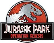
The video game's logo is a combination of the original logo and Jurassic Park III's metallic finish. The T. rex is slightly smaller though, and the head is made much shorter lengthwise. "Operation Genesis" is written in red.
This logo, sans the "Operation Genesis" tag, would go on to become the official series logo for the next ten years until the reveal of the Jurassic World logo and would appear on the box sets of the films as well as other merchandise.
Jurassic World Evolution
Jurassic World Evolution's logo shares its aesthetic with that of Jurassic World: Dominion's preliminary logo, being silver and black in coloration. The subtitle for the game takes a detour from other logos, being placed outside of the ring.
Toylines
Jurassic Park: Chaos Effect
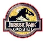
Although most action figure packaging features the logo of the film, the Jurassic Park: Chaos Effect features a different, unique logo that is more high-tech than the other logos. It features a wide, bolted metal border with a faint red outline.
The basic image features a T. rex skeleton virtually identical to the first film's logo skeleton. It features an updated golden yellow background with a net-like grid and the bar holding Jurassic Park: Chaos Effect is shaded black. There is also a slight illumination coming from around the border.
https://www.youtube.com/watch?v=0nI65jgHG9o&feature=youtu.be

